
Enterprise Application Suite Refresh
Role: Director, Project Planner
Skills: Strategy, Vision, Leadership, Communication, Craft, Operations, Accountability, Team Mobilization
Overview
Imprivata provides access management solutions that are simple and secure for end-users who need to use private or shared workstations or devices for industries such as health care and manufacturing. Capabilities across the suite of applications include single sign-on, multifactor authentication, vendor access management, and patient privacy monitoring. This is a highly specialized area typically with a “low pixel footprint” for end-users, but with complex systems and workflows that impact their experience. Imprivata was ranked at the top in the 2022 Best: Software and Services Report by KLAS research for its identity and access management suite.
Most of the Imprivata applications came through acquisition, so over time we had a hodge-podge of experiences that looked and behaved inconsistently. Our customers did not recognize our solutions as part of the Imprivata umbrella. How might we begin to bring them together in a way that moved the products towards a more cohesive experience, without rebuilding each platform via a multi-year, expensive initiative that would put important feature development at risk? Perfect is the enemy of done, and we needed to start somewhere.
This was first and foremost as an experience problem. I was chosen to develop a scalable strategy to harmonize the look and feel of these nine different products built on different code bases. We needed this in place within a short amount of time in order for scrum teams to be able to make updates to their products in time for the 2025 HIMSS Conference. I developed a process and aggressive timeline for my team to complete this while providing high-quality solutions to bring our products together. The designs shared were all done by my team under my direction and feedback; it was truly an amazing team effort with a group of exceptionally talented UX architects, designer/researchers, and visual designers.
Outcomes
-
The stakeholder presentations were productive and the clarity of the rationale and the quality of the work engendered a sense of trust.
-
Because of all the preparation and foundational work, the proposals were well received and what was eventually built was very close to the concepts.
-
The UX team was initially skeptical that we would be able to turn around quality work under such tight deadlines. By giving a clear process for them to work with, and by encouraging them to trust their own expertise, everyone felt engaged and empowered by the end.
-
The Board of Directors gave a huge round of applause at seeing the plan!
"Looking around at the all the screens displaying the various Imprivata products which had adopted the new look and feel, and especially after years of these same products having been developed in their own silos and within their own separate teams, to finally see them with a
unified visual language and experience said to me,'These different capabilities are now all part of one company and one family'."
––Sr. Vice President, Product Management, Imprivata


Background
We had discussed this challenge for years, but a couple of things finally brought this issue to the forefront. Imprivata went through a major corporate and product renaming strategy starting in 2023 as a first step towards presenting a cohesive set of solutions to the market. In addition, we had a new CEO in place, who in their first few months met with many customers and identified a major obstacle in brand recognition: customers did not perceive our products to be part of a suite of related solutions serving the Access Management space. This was especially apparent at the HIMSS Conference, a major showcase for the company. The CEO challenged me to provide a design-led strategy to move towards harmonizing the look and feel to be implemented by the HIMSS 2025. I had to quickly mobilize my team, who still had commitments to their scrum teams, so that we could efficiently and quickly develop a proposal that would set new standards for quality for every product.
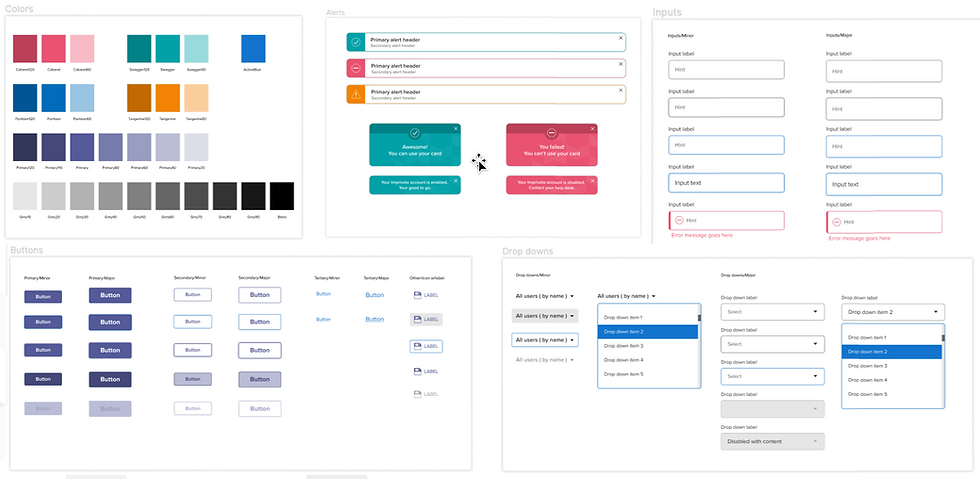
There was one key aspect to this project that enabled its success: while building a greenfield SaaS product as an alternative to our flagship on-premises product, the UX team had been working out what a design system with a modern look and feel and experience would look like. We had already worked closely with marketing to align and inform the new corporate branding strategy. This meant we didn’t have to start from scratch, because we could leverage the thinking already in place.
A bit about our users...
There are many types of personas across the suite, the largest group being Clinicians and Hospital Staff. There are different types of Admins and IT Staff, customer-side Analysts, Managed Services representatives, along with Patients. As you can see with the "current state" gallery above, even a single persona moving around the hospital may have completely different experiences logging into a workstation! Each product will still have something specific to its space in the pattern, but our goal was to narrow the variances so that at a glance, it all felt like the same experience. While the impetus for the project was to improve buyer perception of our offering, the ultimate benefit is for the users who have to interact with our solutions every day.
Identify priorities
Changing the palette and fonts alone across nine products is a massive undertaking, nevermind building a new UI architecture to support a centralized design system. Through conversations with stakeholders, we established that the two most important patterns were the header and navigation on each page, along with the login pattern. These would have to work across many types of environments, including on-prem endpoints, web-based applications, and mobile applications.
Process and timeline
In order to mobilize quickly, I created two committees, one to focus on the header and navigation, and the other on the login pattern. I assigned captains to each who would be in charge of keeping everyone on schedule, and following through on the process. I emphasized that we were not creating something completely new, and we had to trust our judgement as experts in experience to find the best way forward.
The process involved doing an audit across all products to identify common elements and ones unique to each product. The committee was responsible for cataloging this and establishing the primary criteria for the pattern before sketching anything out. There were a series of checkin meetings with and without me, and reviews with the entire product design team. When it was time to present to stakeholders, I acted as emcee while the designers presented.


Login | Audit
With Excel and Figma in hand, the the login committee did a visual and feature/characteristic audit across every application. It was important to be methodical and capture all the similarites and deltas to prioritize the most critical pieces that needed to be included in the base pattern. There would be small differences between each product, but it had to feel like it was part of the same family.


Login | Wireframes
The team iterated on concepts. One of the most important features for customers is the ability to add their logo to the login screen, so this is a key feature.


Login | Visual design
The final palette included additional colors that marketing hadn't accounted for, such as those needed for alerts or chips needed for dense table layouts.


